Quick Answer: Visual consistency increases brand recall by 60–80% and drives an average 23% revenue lift (Lucidpress). Define 5 photographic elements before any shoot: lighting style, color temperature, composition approach, surface/prop palette, and people guidelines. These five decisions, documented in a one-page style guide, create the consistency that builds brand recognition across every channel.
Your brand's visual identity is the first thing people experience and the last thing they remember. Before anyone reads your copy, checks your pricing, or evaluates your product features, they've already formed an impression based on how your brand looks.
And "how your brand looks" increasingly means photography.
Not your logo. Not your color palette. Not your typography. Those matter, but they're the frame. Photography is the painting inside it. It's what fills your website, your social channels, your ads, your packaging, and your pitch decks. It's the visual language that tells people who you are before you say a word.
Yet most brands treat photography as an afterthought. They have a 40-page brand guidelines document covering logo spacing and hex codes, and zero guidance on what their photography should look like. The result is a visual identity that feels fragmented, with different photographers, styles, and moods across different touchpoints. It works against brand recognition instead of building it.
This guide is about fixing that. It's a practical framework for building a cohesive visual brand identity through photography, whether you're a startup establishing your first visual language or an established brand ready to professionalize and unify your imagery.
Why Photography Defines Your Brand More Than Your Logo
Think about the brands you admire. Picture Apple, Nike, Glossier, or Patagonia in your mind.
What do you see? It's not their logo. It's their photography.
Apple's product photography is clean, precise, and obsessively detailed. Every shadow is intentional. Every surface reflection is controlled. The products float in perfect isolation against white or dark gradients.
Nike's imagery is kinetic and aspirational. Bodies in motion, sweat and determination, dramatic lighting that turns athletes into heroes.
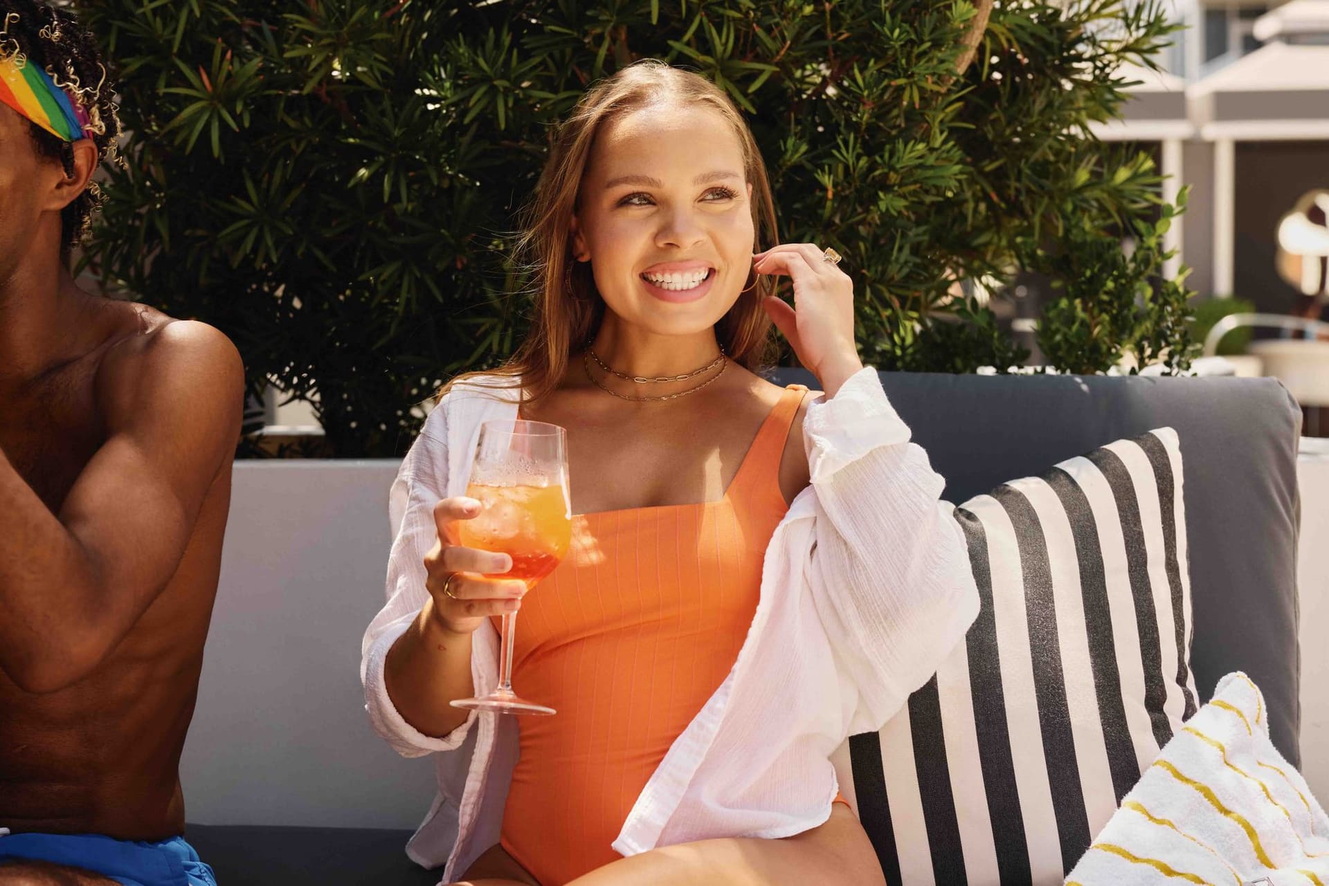
Glossier's photography is soft, natural, and inclusive. Imperfect skin, casual poses, morning light through gauze curtains.
Patagonia's imagery is vast landscapes, real adventure, worn equipment. Nothing looks staged because nothing is.
Each brand has a photographic style that's instantly recognizable, even without the logo. That's the power of a cohesive visual identity built through photography.
A Lucidpress study found that consistent brand presentation across all platforms increases revenue by an average of 23%. For early-stage brands, the stakes are even higher: research from the Nielsen Norman Group found that users form a first impression of a website's visual design within 50 milliseconds: before reading a word. That 50-millisecond judgment is driven almost entirely by photography style, color, and layout.
The Brand Recognition Effect
Research on brand recognition consistently shows that visual consistency increases brand recall by 60-80%. That's not about using the same logo everywhere. It's about maintaining a consistent visual language, color temperature, lighting style, composition approach, and overall mood, across every touchpoint.
When someone scrolls past your Instagram ad, visits your website, and then sees your product on Amazon, each experience should feel like it came from the same universe. Not identical, but harmonized. That harmony is what builds the subconscious familiarity that drives purchasing decisions.
The Trust Factor
Inconsistent photography signals inconsistency in everything else. Whether that's fair or not, it's how humans process information. If your website looks premium but your Amazon listing images look like they were shot on a phone, customers question which version of your brand is real.
Consistent, professional photography signals that you care about details, that you invest in quality, and that you're a brand worth trusting. It's the visual equivalent of a firm handshake.
The Five Elements of Photographic Brand Identity
A cohesive photographic brand identity isn't just "use the same filter on everything." It's a system built from five interconnected elements.
1. Lighting Style
Lighting is the most powerful element in photography, and it's the first thing to define in your brand's visual system.
Hard light creates strong shadows and high contrast. It feels dramatic, editorial, and fashion-forward. Brands that use hard lighting tend to project confidence and edge.
Soft light creates gentle gradients and minimal shadows. It feels approachable, warm, and natural. Brands using soft light tend to project friendliness and accessibility.
Backlight creates glow and atmosphere. It feels dreamy, aspirational, and elevated. Common in beauty and wellness brands.
Side light creates depth and dimension. It feels textured, detailed, and premium. Common in food, craft, and artisanal brands.
Natural light (or simulated natural) feels authentic and unforced. It's the default for brands that prioritize realness over polish.
Your brand doesn't need to use only one lighting style, but you need a primary approach that appears in at least 70% of your imagery. The remaining 30% can vary for specific contexts (e.g., softer lighting for lifestyle shots, more dramatic for hero products) as long as the overall mood stays cohesive.
2. Color Palette and Temperature
This goes beyond your brand's logo colors. It's about the overall color temperature and palette of your photography.
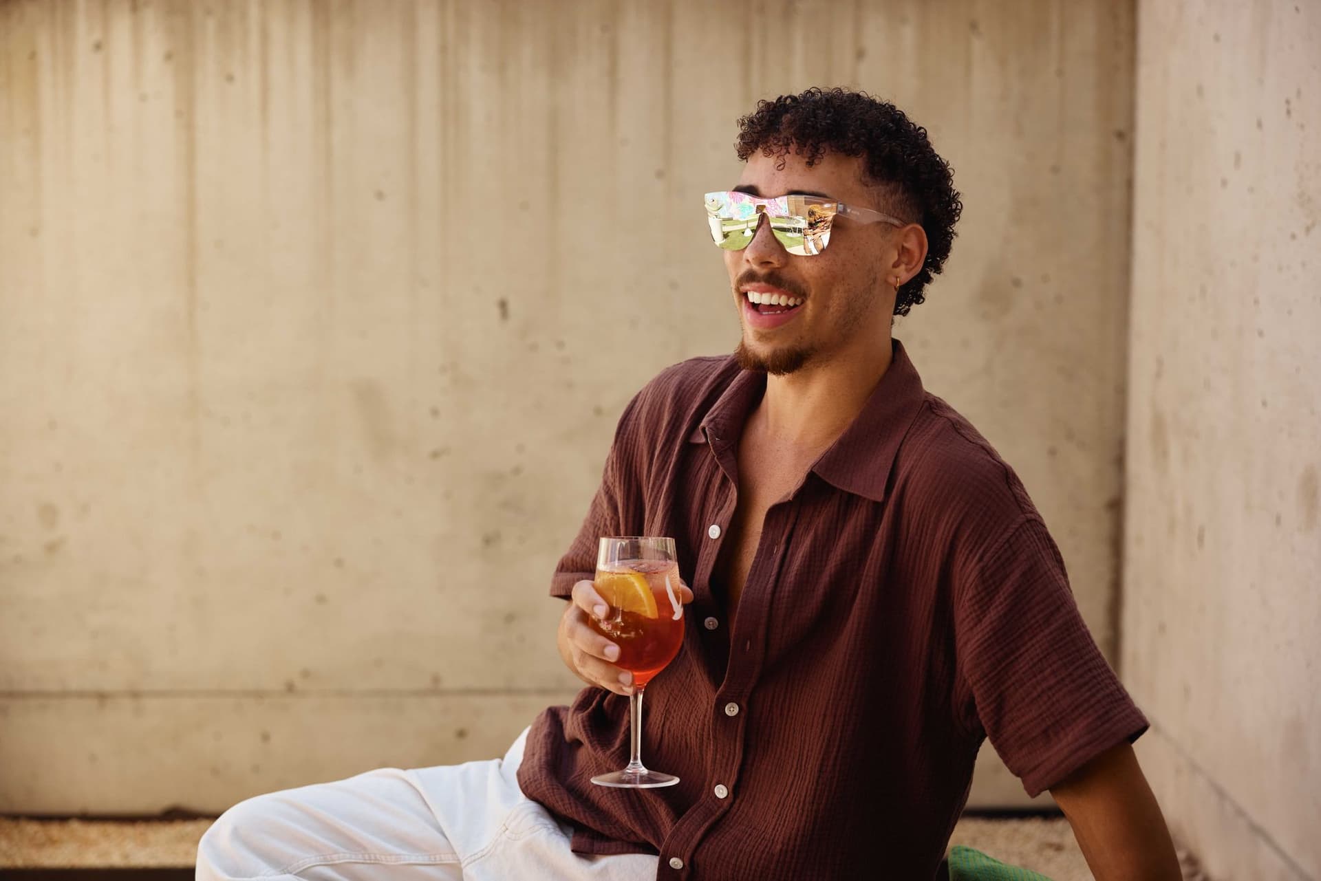
Warm photography (golden tones, amber undertones, sunset color temperature) feels inviting, cozy, and organic. It works well for food, lifestyle, hospitality, and wellness brands.
Cool photography (blue-white tones, crisp highlights, daylight or overcast temperature) feels clean, modern, and clinical. It works well for tech, healthcare, and luxury brands.
Neutral photography (balanced white, true-to-life colors, minimal color cast) feels honest and straightforward. It works well for brands that want the product to speak for itself.
Saturated photography (rich, vibrant colors, high color intensity) feels energetic and bold. It works well for brands targeting younger audiences or brands with strong color identity.
Desaturated photography (muted tones, pulled-back color, earthy palette) feels sophisticated and understated. It works well for premium and heritage brands.
Define your color temperature (measured in Kelvin) and your saturation approach. Apply it consistently across all photography. This single decision will do more for visual cohesion than any filter or preset.
3. Composition and Framing
How you frame and compose your images establishes a visual rhythm that becomes part of your brand language.
Centered composition feels stable, confident, and product-focused. Common for hero product shots and brands that want their product to be the undeniable focal point.
Rule-of-thirds composition feels dynamic and storytelling-oriented. Products placed off-center with environmental context create narrative and mood.
Negative space (product small in frame, lots of empty space) feels premium and editorial. It suggests that the brand is confident enough to breathe, not desperate to fill every pixel.
Tight crops feel intimate and detail-oriented. Close-ups of textures, materials, and craftsmanship communicate quality and care.
Environmental wide shots feel contextual and lifestyle-driven. They show the product as part of a larger world.
Most brands benefit from a primary composition approach (60-70% of images) with secondary approaches for variety. Document your preferred framing in your brand guidelines so every photographer who works with you knows the expectation.
4. Surfaces and Props
The objects and surfaces that surround your product in photography become part of your brand's visual vocabulary.
Minimalist approach (few or no props, clean surfaces, no distractions) puts all focus on the product. Works for tech, luxury, and design-forward brands.
Curated lifestyle (carefully selected props that complement the product, editorial but not cluttered) tells a story about how the product fits into someone's life. Works for home, food, beauty, and fashion brands.
Natural/organic (found objects, imperfect textures, natural materials like wood, stone, and linen) communicates authenticity and craft. Works for artisanal, sustainable, and wellness brands.
Industrial/modern (metal, concrete, glass, geometric shapes) communicates innovation and edge. Works for tech, spirits, and fashion brands.
Create a prop and surface palette just like you create a color palette. Define what materials, textures, and objects belong in your brand's visual world, and which ones don't.
5. People and Perspective
If your photography includes people, the way you portray them becomes central to your brand identity.
Aspirational (professional models, styled and idealized, photographed at their best) positions your brand as something to strive for.
Relatable (diverse, imperfect, genuine expressions, minimal styling) positions your brand as accessible and inclusive.
Professional (business-appropriate, polished but not glamorized) positions your brand as trustworthy and competent.
No people (product-only, environment-only) keeps the focus entirely on the product. This is increasingly common for brands that want their product to be the hero.
Also consider perspective: are you shooting from the consumer's eye level (immersive), from above (editorial), from below (heroic), or straight-on (informational)? Each perspective carries emotional weight.
Building Your Photography Brand Guide
Once you've defined your five elements, document them in a photography section of your brand guidelines. This doesn't need to be a 50-page document. It needs to be clear, specific, and illustrated with examples.
What to Include
Visual mood board. Collect 15-20 reference images that represent your brand's photographic style. Include examples of lighting, color, composition, props, and people. This is the most important page in your guide because it communicates more than words ever could.
Do's and don'ts. Show specific examples of images that match your brand and images that don't. Be concrete. "Warm lighting with side-light emphasis, like image A" is useful. "Photography should feel authentic" is not.
Technical specifications: - Primary lighting style - Color temperature range (e.g., 4500K-5500K) - Saturation level (e.g., slightly desaturated, -10% from true) - Preferred crop ratios for each platform - Minimum resolution requirements - File naming conventions
Surface and prop palette. List of approved materials, textures, and prop categories. Include examples and, if possible, specific items or sources.
People guidelines. If applicable, define who appears in your photography, how they're styled, and how they're posed. Include diversity expectations and any legal requirements for model releases.
Platform-specific notes. Instagram has different visual norms than LinkedIn. Your brand guide should note any platform-specific adjustments while maintaining overall cohesion.
The Startup Photography Playbook
If you're a startup or early-stage brand in Austin, you don't need a $50,000 brand photography campaign. You need a smart, strategic approach that establishes your visual identity from day one and scales as you grow.
Phase 1: Foundation (Launch to $500K Revenue)
Goal: Establish your core visual identity with a limited but cohesive set of images.
Investment: $2,000-$5,000 for one studio session.
Deliverables: - 5-8 hero product shots (clean, accurate, versatile) - 10-15 lifestyle images (product in context) - 3-5 brand texture shots (materials, details, craft) - Platform-formatted versions for web, social, and marketplace
AI integration: Use AI to generate additional platform variations and seasonal updates from your source images. This stretches a single shoot into 3-6 months of content.
At this stage, consistency matters more than volume. Every image should feel like it came from the same brand. Resist the temptation to work with multiple photographers or use stock images that don't match your style.
Phase 2: Expansion (Revenue $500K-$2M)
Goal: Build a comprehensive content library that supports multi-channel marketing.
Investment: $5,000-$15,000 per year (2-3 shoot sessions).
Deliverables: - Full product line photography (all SKUs) - Campaign-specific lifestyle imagery - Video content (product demos, social clips) - Seasonal content refreshes - Team and workspace photography
AI integration: Implement AI-enhanced content production for social media volume. Monthly content batches generated from source material.
Phase 3: Maturity ($2M+ Revenue)
Goal: Dominate visual presence across all channels with distinctive, ownable photography.
Investment: $15,000-$50,000+ per year (quarterly shoots plus ongoing production).
Deliverables: - Hero campaign photography - Ongoing social content production - Video series and brand films - Event and editorial photography - Influencer and partnership content - Retail and wholesale collateral
AI integration: Full hybrid production workflow with AI handling high-volume variations and traditional photography reserved for hero content and campaigns.
How AI Supports Visual Brand Consistency
One of the most underappreciated benefits of AI in photography is its ability to maintain brand consistency at scale.
Training AI on Your Brand's Visual Language
At 51st & Eighth, we train custom AI models on each client's photographic style. The model learns your lighting preferences, color palette, composition tendencies, and overall mood. When it generates variations, they maintain the visual language that makes your brand recognizable.
This is fundamentally different from using a generic AI tool and applying a filter. A custom-trained model understands the nuance of your brand's visual identity, the specific warmth of your lighting, the exact surfaces and materials that belong in your world, the compositional balance that defines your aesthetic.
Scaling Without Fragmenting
The traditional challenge of scaling content production is fragmentation. More photographers, more shoots, more touchpoints means more opportunities for visual inconsistency.
AI solves this by becoming the consistency layer. Regardless of how many source images are feeding the pipeline, the AI model applies a unified visual treatment that maintains brand cohesion across every output.
This doesn't replace the need for a strong photography brand guide. It enforces it.
Rapid Iteration Without Visual Drift
Brands evolve, and your visual identity should evolve with them. But evolution needs to be intentional, not accidental.
AI allows you to test visual direction changes rapidly. Want to see what your brand looks like with slightly cooler tones? More dramatic lighting? A different surface palette? Generate samples in hours instead of scheduling a new shoot. If the direction works, update your brand guide and retrain your AI model. If it doesn't, no harm done.
Common Visual Identity Mistakes
Mistake 1: Copying Another Brand's Photography Style
"We want to look like Glossier" is the most common brief we hear from beauty brands. "We want to look like Apple" is the tech equivalent.
Borrowing inspiration is fine. Copying a style wholesale is a strategic error. You'll always look like a cheaper version of the original, and you'll train your audience to associate your visual language with someone else's brand.
Instead, identify what you like about their approach (e.g., "natural lighting," "negative space," "warm tones") and translate those principles into something uniquely yours.
Mistake 2: Changing Style Every Campaign
Consistency requires patience. Some brands reinvent their visual identity every quarter, chasing trends or getting bored with their current look. This destroys brand recognition.
The most iconic visual brands (Apple, Nike, Aesop, Muji) have maintained their core photographic style for years, sometimes decades. They evolve slowly, making small adjustments rather than wholesale changes.
Commit to your visual identity for at least 12-18 months before making significant changes. Let it settle into your audience's subconscious.
Mistake 3: Different Photographers, Different Styles
If you work with three different photographers who each have their own style, your brand photography will look like three different brands. This is extremely common with growing companies that hire different freelancers for different projects.
Solutions: - Work with one photographer or studio consistently - Share your photography brand guide before every shoot - Use AI to apply consistent post-production treatments across different source material - Review all photography against your mood board before publishing
Mistake 4: Treating Photography and Design as Separate
Your photography and your graphic design need to work together as a system. If your design language is minimal and modern but your photography is warm and rustic, you've created a visual contradiction.
When developing your photographic style, consider how images will interact with your typography, color system, and layout patterns. The best visual brands feel seamless, where the photography and the design breathe together.
Mistake 5: Neglecting Your Team and Workspace Photography
If your brand has a face (a founder, a team), the photography of people needs to match the photographic style of your products. Mismatched team photos and product photos feel disconnected and unprofessional.
Shoot team photos in the same visual language as your product photos. Same lighting approach, same color temperature, same mood. This creates a unified brand world where everything belongs together.
The Austin Brand Photography Landscape
Austin's creative community offers brands a range of options for building photographic identity:
Full-service studios (like 51st & Eighth) handle everything from brand strategy and art direction through shooting, AI-enhanced production, and multi-platform delivery. Best for brands that want a single partner to own their visual identity.
Independent commercial photographers bring strong artistic vision and personal style. Best for brands that have found a photographer whose existing aesthetic matches their desired identity.
Content agencies focus on high-volume social and digital content. Best for brands that need volume over art direction.
Freelance networks offer flexibility and cost efficiency. Best for brands with strong internal art direction that can manage multiple creative relationships.
The Austin market's strength is its depth of talent across all of these categories. The city supports a creative ecosystem that rivals markets twice its size, at a fraction of coastal pricing.
Getting Started
If your brand's visual identity feels scattered, inconsistent, or undefined, here's how to get it on track:
Step 1: Audit what you have. Pull every brand photo you've published in the last 12 months. Lay them out side by side. Do they look like they belong together? Where are the inconsistencies?
Step 2: Define your visual elements. Work through the five elements (lighting, color, composition, props, people) and make specific decisions for each.
Step 3: Build your mood board. Collect 15-20 reference images that capture the look and feel you're after. This becomes the north star for every photographer and designer you work with.
Step 4: Shoot your foundation. Book a studio session focused on creating your core image library. Start with hero products and lifestyle shots that establish your visual language.
Step 5: Systematize. Document your decisions in a photography brand guide. Share it with every vendor who touches your visual content.
A strong visual brand identity is one of the few marketing investments that compounds over time. Every image you add to a cohesive system strengthens brand recognition, builds trust, and makes all your other marketing more effective.
Want help defining or refining your brand's visual identity? Contact us at 51st & Eighth. We work with Austin brands at every stage, from startup launches to enterprise refreshes, to build photographic systems that last.
Frequently Asked Questions
What's the first step in building a photographic brand identity from scratch? Build your mood board before booking a photographer. Spend 30–60 minutes on Pinterest, Instagram, and competitor research collecting 15–20 images that capture the look and feel you want. Then extract the common elements: lighting approach, color temperature, compositional style, prop palette: and write 2–3 sentences for each. This becomes the foundation of your photography brief and your visual style guide.
How do I create visual consistency when I can't afford to shoot everything professionally? Pick the 2–3 touchpoints that matter most: typically your website hero images, product pages, and paid ad creative: and invest in professional photography there. For everything else (social media, email, blog), create a simple DIY guide: one window, one foam board reflector, one standard distance from product, one editing preset applied to every photo. Consistency beats quality in volume channels.
How does lighting style affect brand perception? Dramatically. Soft, diffused lighting signals approachability and warmth: it's used by wellness, food, and lifestyle brands. Hard, directional lighting signals confidence and edge: fashion and spirits brands favor it. Bright, high-key lighting signals cleanliness and modernity: tech and skincare brands use it. Choosing the wrong lighting style for your brand's positioning creates a subconscious disconnect even when everything else is right.
When should I update my visual brand identity? Update when there's a strategic trigger: you're rebranding, you've significantly changed your target audience, your current photography no longer reflects your product quality, or your visual identity has become indistinguishable from competitors. Don't update simply because you're bored with the look: brand recognition compounds over time, and constant style changes reset that equity to zero.
Ready to elevate your brand identity photography?
Get a free quote from Austin's leading brand photography studio.
Get a Free Quote →