Quick Answer: Packaging photography requires specialized lighting to capture metallic foils, embossing, and accurate print colors : standard product photography setups cause premium finishes to disappear, colors to shift, and the design work to be lost entirely in translation to screen or print.
You spent months on your packaging design. The colors are right, the typography is sharp, the unboxing experience is dialed in. Then you photograph it, and the result looks nothing like what you designed. The metallic foil reads as gray. The embossing disappears. The colors shift. The whole thing looks flat and lifeless in a way that the physical product never does.
This is one of the most common frustrations we hear from CPG brands, DTC startups, and packaging designers. The gap between how a package looks in person and how it looks in a photograph can be enormous: and it's almost always a photography problem, not a design problem.
Packaging photography sits at the intersection of product photography and graphic design documentation. You're not just photographing an object; you're photographing a designed surface that needs to reproduce accurately while also looking appealing enough to drive purchases. That's a fundamentally different challenge than shooting, say, a piece of apparel or a piece of furniture.
At our Austin studio, we've photographed packaging for everything from craft spirits to skincare lines, specialty coffee to supplements. Each category has its own challenges, but the core principles remain consistent. This guide covers what we've learned about getting packaging photography right.
According to research from Ipsos, 72% of consumers say packaging design influences their purchase decisions, making accurate packaging photography as important as the design itself. Research from Nielsen shows that for 64% of consumers who try a new brand, the packaging or visual presentation is the primary driver of that first purchase. Industry estimates suggest that brands with high-quality, accurate packaging photography convert at 25–35% higher rates than those with poor or inaccurate visuals : meaning photography quality is a direct multiplier on the ROI of your packaging design investment.
Why Packaging Photography Is Harder Than It Looks
Most product photography focuses on the product itself: its shape, texture, material. Packaging photography adds another layer: you're also photographing print design. That means you need to accurately capture colors, typography, finishes, and structural details simultaneously.
The Material Problem
Packaging uses materials that are notoriously difficult to photograph:
- Glossy finishes create hotspots and reflections that obscure the design
- Matte finishes can look dull and lifeless without careful lighting
- Metallic foils and inks reflect light differently at every angle
- Transparent or translucent elements (windows, clear labels) introduce complexity
- Textured surfaces (embossing, debossing, soft-touch coatings) need directional light to be visible
- Dark packaging absorbs light and loses detail in shadows
Each of these materials requires a different lighting approach. A setup that works perfectly for a matte kraft box will completely fail on a glossy black bottle with metallic labeling. This is why packaging photography often takes longer per product than other types of product photography: you're solving a new lighting puzzle with each piece.
The Color Accuracy Challenge
When you photograph packaging, color accuracy isn't optional. A brand manager who approved Pantone 485C on the printed box expects to see that same red in the photograph. If the image skews orange or crimson, it creates confusion with retailers, misaligns with brand guidelines, and can even create legal issues with regulated products.
Achieving accurate color in packaging photography requires:
- Calibrated monitors for review and post-production
- Color checker cards shot alongside the product for reference
- Consistent color temperature in lighting (mixed lighting is the fastest path to color problems)
- Custom white balance rather than auto settings
- ICC profiles matched to your output (web vs. print vs. retailer portal)
This might sound technical, and it is. But skipping any of these steps means your packaging photos will drift from reality, and that drift compounds across your entire product line.
Essential Lighting Setups for Packaging
Lighting is where packaging photography succeeds or fails. Here are the setups we use most frequently.
The Diffused Side Light Setup
This is our default starting point for most packaging. A large softbox placed at roughly 45 degrees to one side of the product, with a reflector or fill card on the opposite side to open up shadows.
Why it works:
- Creates gentle gradients across the packaging surface
- Reveals texture without harsh shadows
- Maintains readability of typography and design elements
- Works well for both matte and semi-gloss surfaces
The key adjustment is the angle. Move the light further to the side to emphasize texture (great for embossed or textured packaging). Bring it closer to the camera axis to reduce shadows and make flat design elements more readable.
The Strip Light Setup for Glossy Packaging
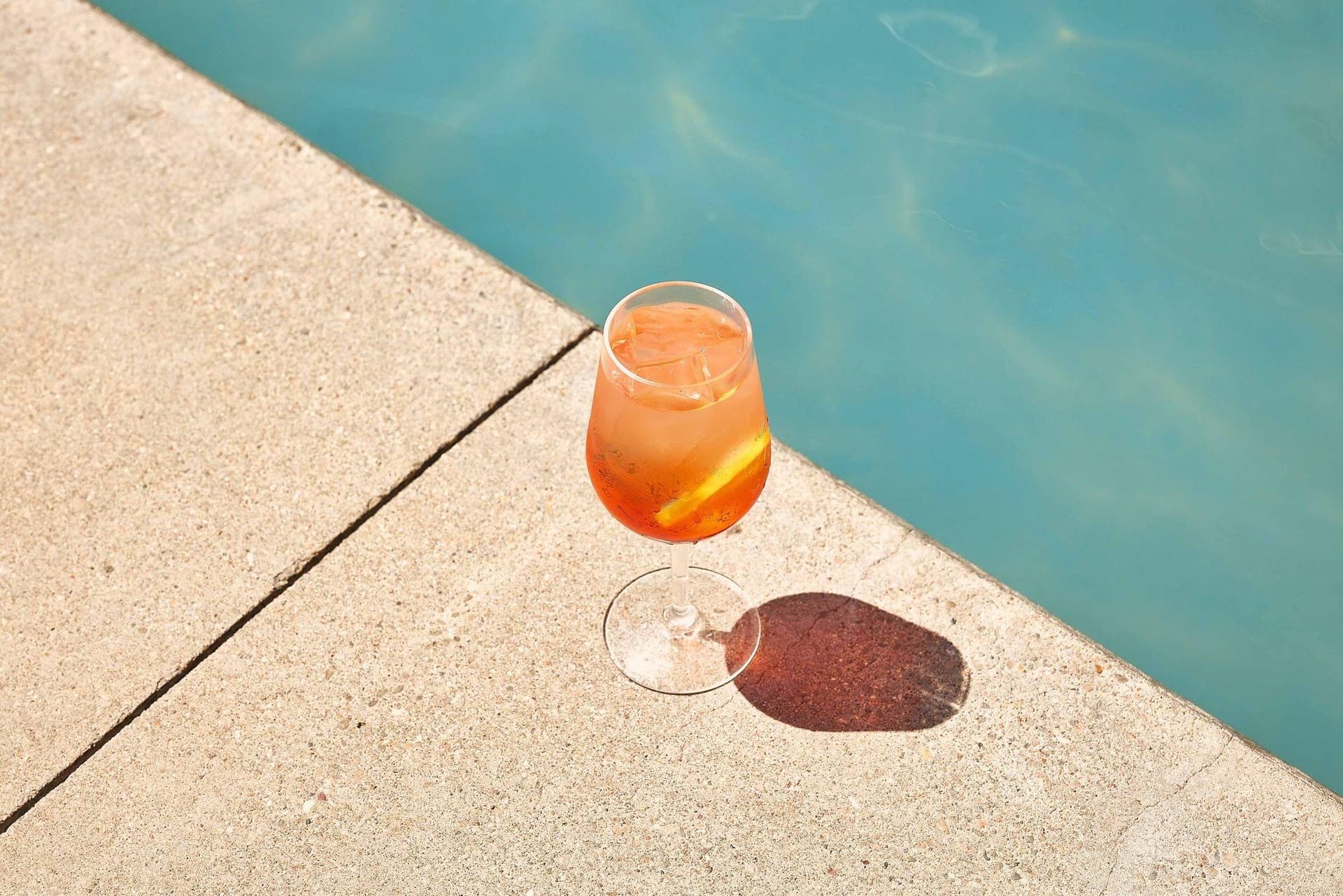
Glossy and high-shine packaging: think glass bottles, lacquered boxes, metallic pouches: needs a different approach. Broad, soft light sources create large, controlled reflections that define the shape of the product.
We typically use:
- Two strip softboxes positioned at angles that create clean edge reflections
- A large overhead diffusion panel to control the top reflection
- Black cards (negative fill) to create definition where needed
The goal is to control exactly where the reflections appear. Uncontrolled reflections obscure the design. Carefully placed reflections make the packaging look dimensional and premium.
The Backlight Setup for Transparent Packaging
If your packaging has transparent or translucent elements: a clear window showing the product inside, a glass bottle, a transparent pouch: backlighting becomes essential.
A light placed behind and slightly below the product illuminates the transparent areas, making the contents visible and the packaging feel three-dimensional. You'll still need front or side fill to light the label and opaque elements.
This setup requires careful flagging (blocking light from hitting the lens directly) and often takes longer to dial in, but the results are worth it. Transparent packaging photographed without backlighting looks dead.
Shooting Angles That Sell
The angle you choose for packaging photography directly impacts how much information the viewer receives and how appealing the product looks.
The Three-Quarter View
This is the workhorse angle for packaging photography. The camera is positioned slightly above and to one side of the product, showing the front face and one side. This angle:
- Shows the primary design panel (front label, logo, key messaging)
- Creates a sense of dimension and physical presence
- Gives context about the packaging's depth and shape
- Works for both individual shots and group compositions
For most e-commerce listings, this is your hero shot.
The Straight-On View
A flat, front-facing shot that shows the primary design panel without any dimensional distortion. This angle is essential for:
- Amazon main images (which require the product against white with minimal angles)
- Design documentation and brand asset libraries
- Retailer planogram submissions
- Side-by-side product comparisons
The challenge with straight-on shots is that they can look boring. The packaging looks flat because it is flat in the image. Careful lighting that creates subtle gradients across the surface can add life without distorting the design.
The Top-Down View
Looking straight down at the product. This works particularly well for:
- Flat packaging (pouches, sachets, blister packs)
- Box sets or kits where the arrangement matters
- Showing packaging alongside the product it contains
- Social media content, especially Instagram flat lays
The Detail Shot
Close-up shots of specific packaging elements: the foil stamp, the embossed logo, the texture of the paper stock, the seal, the closure mechanism. These shots serve dual purposes: they work as marketing content and as quality documentation for production teams.
Styling Packaging for Different Contexts
How you style a packaging shoot depends entirely on where the images will be used.
E-Commerce and Marketplace Listings
Clean, informative, consistent. The packaging should be the clear focus with minimal distraction. White or light gray backgrounds are standard. Show all panels (front, back, sides) individually. Include detail shots of key information (nutrition panels, ingredients, usage instructions).
Consistency across your product line matters enormously here. If you have twelve SKUs, the lighting, angle, and background should be identical across all twelve. Inconsistency looks unprofessional and makes your brand look disorganized on a retail page.
Social Media and Brand Marketing
This is where you can get creative. Lifestyle contexts, props, color backgrounds, motion: all fair game. The goal shifts from pure information to emotional connection and brand storytelling.
Effective approaches include:
- Ingredient or material callouts: Surround the packaging with raw ingredients, materials, or elements that connect to the product inside
- In-context usage: Show the packaging being held, opened, or used in a real environment
- Flat lay compositions: Arrange multiple products, props, and brand elements in an overhead composition
- Seasonal styling: Adapt the styling to current seasons or cultural moments
Retail and Trade Presentations
If you're pitching to buyers at retailers, your packaging photography needs to show the product as it will appear on a shelf. This means:
- Shots showing the packaging at eye level (simulating shelf position)
- Group shots showing how multiple SKUs look together
- Planogram-ready images with precise dimensions
- Sometimes, mockup shots showing the product on an actual retail shelf
Print Advertising and Packaging Awards
These require the highest production value. Large format print exposes every flaw. Competition entries are judged against the best packaging photography in the world. This is where premium lighting, perfect retouching, and precise color management earn their investment.
Common Packaging Photography Mistakes
Mistake 1: Ignoring the Label Curve
On bottles, cans, and cylindrical packaging, the label wraps around a curved surface. If you light it flat, parts of the label will be unreadable. If you don't position the product carefully, key information will wrap out of view.
The fix: position the product so the most important design elements are facing the camera, and use lighting that follows the curve of the label. In post-production, minor warping corrections can straighten text that curves slightly at the edges.
Mistake 2: Over-Retouching
It's tempting to fix every tiny imperfection in post-production. A small dent, a slightly misaligned label, a barely visible dust speck. But over-retouching packaging creates an uncanny-valley effect: the product looks too perfect, too smooth, too digital. Customers see the overly polished image online, then receive the real product and feel disappointed, even if the product is perfectly fine.
Clean up genuine defects. Leave the natural character of the materials intact.
Mistake 3: Wrong White Balance for Different Materials
A single white balance setting might be correct for the paper elements of your packaging but wrong for the metallic elements. This is especially problematic when packaging combines warm kraft paper with cool silver foil, or when clear plastic sits alongside colored cardboard.
The solution is to light with a single, consistent color temperature and fine-tune specific elements in post-production if needed. Never mix daylight and tungsten in a packaging shot.
Mistake 4: Forgetting the Back Panel
Many brands invest heavily in front-panel photography and completely neglect the back panel, sides, and bottom. E-commerce customers want to see the full package: ingredients, nutrition facts, usage instructions, certifications. These "boring" shots drive purchase confidence.
Mistake 5: Shooting Samples Instead of Production Units
Prototype packaging and production packaging often look different. Colors shift between proofing and final printing. Materials change. Finishes vary. Always photograph final production units whenever possible. If you must shoot prototypes, flag those images clearly so they're replaced later.
Packaging Photography for Different Product Categories
Food and Beverage Packaging
The biggest challenge is making the packaging look appetizing without showing the actual food. The packaging design has to do the heavy lifting. Lighting that emphasizes warmth, richness, and texture helps. Props can suggest the eating or drinking occasion without upstaging the packaging.
For products with transparent windows (many bakery items, some snack foods), the contents need to look as good as the packaging. This often means styling the actual product inside the package, which turns a packaging shoot into a partial food styling shoot.
Cosmetics and Skincare Packaging
Premium finishes are the norm: metallic inks, soft-touch coatings, gradient color schemes, minimalist typography. These require precise lighting to look as luxurious in photos as they do in person. Clean, sophisticated styling with minimal props. Often shot on colored backgrounds that complement the brand palette rather than plain white.
Supplements and Wellness Products
These products typically have dense information panels and regulatory requirements. Photography needs to balance showing the brand design (front panel) with clearly communicating product information (supplement facts, dosage instructions). Lifestyle context can help differentiate supplements from pharmaceutical products.
Spirits and Craft Beverages
Glass bottles with multiple finish types on a single product: foil capsules, embossed glass, transparent liquid, printed labels, sometimes wax seals. These are among the most technically challenging products to photograph. Each element of the bottle needs its own lighting consideration.
How AI Is Changing Packaging Photography
AI tools are beginning to impact packaging photography in specific ways.
What AI can do well right now:
- Generate lifestyle backgrounds and contextual scenes around a photographed package
- Create seasonal variations of existing packaging shots (holiday themes, seasonal color palettes)
- Produce rapid mockups for design review before a final shoot
- Remove backgrounds and create clean cutouts at scale
What AI still struggles with:
- Accurately reproducing specific Pantone colors and metallic finishes
- Capturing the tactile qualities of premium packaging materials
- Generating photorealistic images of packaging with readable, accurate text
- Producing images that meet the technical standards required by major retailers
The practical approach right now is to use traditional photography for your core packaging imagery: the shots that need to be pixel-perfect and color-accurate: and use AI to extend those assets into additional contexts, seasons, and formats. This hybrid workflow can reduce the number of individual shoots you need while maintaining the quality baseline that packaging photography demands.
Planning a Packaging Photography Shoot
What to Prepare
Before the shoot day:
- Final production units: Minimum 3-5 units of each SKU (to select the best one and have backups)
- Brand guidelines: Pantone references, logo usage rules, any retailer-specific requirements
- Shot list: Every angle, every context, every variation you need
- Props and styling elements: Anything you want in lifestyle shots
- Surface and background materials: If you have specific preferences
- Reference images: Examples of packaging photography you admire
How Long Does It Take?
A realistic timeline for packaging photography:
- Simple packaging, white background: 8-15 products per day
- Complex packaging with multiple materials: 4-8 products per day
- Lifestyle and styled shots: 3-6 setups per day
- Premium/editorial quality: 2-4 products per day
These estimates assume a single product per shot. Group compositions and flat lays take additional time.
Budget Considerations
Packaging photography typically falls in the mid-to-upper range of product photography pricing because of the technical demands. Expect to invest more per image than you would for simple product shots on white. The investment pays for itself in accurate representation, fewer customer returns due to mismatched expectations, and stronger retail presentations.
For brands with large SKU counts (20+), consider a phased approach: shoot the hero SKUs with full lifestyle treatment and the remaining SKUs with a simpler, consistent setup. This balances budget with quality.
Getting the Most from Your Packaging Images
Once you have strong packaging photography, maximize its value:
- Repurpose across channels: E-commerce, social media, email marketing, sales decks, trade show materials
- Create size variations: Hero images, thumbnails, banner crops, square social posts
- Build a living library: Organize by SKU, angle, and context for easy access across teams
- Update regularly: Reshoot when packaging designs change, new SKUs launch, or seasonal campaigns require fresh content
- Share with retail partners: Provide high-resolution images to retailers proactively: it improves how your product appears on their sites
Good packaging photography is an investment in how your brand shows up everywhere. The packaging is often the first physical touchpoint a customer has with your product. Making sure it photographs as well as it was designed is worth the effort.
51st & Eighth is an Austin-based creative studio specializing in product and packaging photography for CPG brands, DTC startups, and retail-ready products. [Get in touch](/contact) to discuss your packaging photography needs.
Frequently Asked Questions
Q: How do you photograph metallic or foil packaging without blowing out the highlights? A: The key is polarized light. Using circular polarizing filters on both your light sources and your camera lens eliminates specular (mirror-like) reflections from metallic surfaces, allowing the foil's color and any printed design beneath it to become visible. Without polarization, metallic packaging either looks pure white (overexposed) or dark (underexposed), with neither showing the design accurately. Polarized photography is a non-negotiable technique for foil stamping, metallic inks, and chrome finishes.
Q: Do I need professional photography for packaging if I already have my design files? A: Yes : design files and photography serve different purposes. Your design files are for print production. Photography is for every digital touchpoint: e-commerce listings, retailer portals, social media, press kits, investor materials, and advertising. Most retailers require photograph-based product images, not design renderings. And photography captures the physical reality of your packaging : the way it feels, the dimension, the premium finish : in ways that flat design files cannot.
Q: How many packaging photographs do I need per SKU? A: Plan for a minimum of four to six images per SKU: front label (hero), back label, side panels (if text is present), top/bottom if relevant, a detail close-up of any premium finish (foil, emboss, matte texture), and a lifestyle or in-context shot. For retail submissions, most buyers require all primary panel images plus a lifestyle image. For Amazon, a pure white background front shot plus secondary lifestyle images meets platform requirements.
Q: How do I ensure my packaging photos match the actual print colors? A: Use a color checker card during the shoot and reference it in post-production to calibrate your editing to the physical product's colors. Shoot tethered to a calibrated monitor so you can evaluate colors in real-time. Communicate the Pantone or CMYK values of critical brand colors to your photographer and retoucher as reference targets. This process won't achieve perfect color management (screen and print use different color models), but it gets as close as current technology allows.
Ready to elevate your packaging photography?
Get a free quote from Austin's leading product photography studio.
Get a Free Quote →