Quick Answer: Visual consistency increases brand recall by 60–80% (Lucidpress). Define your photography style guide before shooting anything: covering lighting style, color temperature, composition approach, background palette, and model/people guidelines. Brands with consistent visual identities across platforms see an average 23% higher revenue than inconsistent competitors.
You've seen it happen: a brand's Instagram feed looks nothing like their website. Their product photography uses different lighting styles from post to post. Their email campaigns feel disconnected from their packaging. The brand has no visual identity: it's a collection of random design decisions.
Here's the hard truth: inconsistent visuals kill brand recognition. When customers see your content across different platforms, they should immediately recognize it as yours: not because of your logo, but because of your distinctive visual language.
Think about brands you recognize instantly. Apple's minimalist product photography. Nike's bold, athletic lifestyle imagery. Glossier's soft, approachable aesthetic. These brands didn't achieve visual consistency by accident. They created detailed photography and design guidelines, and they enforce those standards across every touchpoint.
If you're a marketing director or brand manager, you've likely struggled with this. You work with multiple photographers, designers, and agencies. You're creating content for your website, social media, email, print ads, and retail displays. Maintaining visual consistency across all these channels and collaborators feels impossible.
At our Austin studio, we help brands build and maintain cohesive visual identities through detailed photography guidelines, systematic production workflows, and AI tools that scale consistency across hundreds or thousands of images.
This guide breaks down how to create a visual brand identity that's distinctive, memorable, and consistent across every platform where customers encounter your brand.
What Is Visual Brand Identity (and Why It Matters)
Visual brand identity is the sum of all visual elements that represent your brand: photography style, color palette, typography, graphic elements, and design principles.
It's distinct from your logo (which is just one element) and your overall brand strategy (which includes messaging, values, and positioning). Visual identity is specifically about how your brand looks and feels.
A Lucidpress study found that consistent brand presentation across platforms increases revenue by an average of 23%. For e-commerce brands specifically, a Stanford Web Credibility study found that visual inconsistency was among the top signals consumers use to judge whether a website is trustworthy: ranking higher than price, copy, or social proof in preliminary trust evaluation.
Why Consistency Drives Recognition
Brand recognition is built through repetition and consistency. When customers see similar visual patterns repeatedly, they begin to associate those patterns with your brand.
This is why:
- Coca-Cola always uses the same shade of red
- Tiffany trademarked their specific blue
- McDonald's golden arches are identical worldwide
- Apple products are shot on pure white backgrounds with perfect lighting
Consistency creates mental shortcuts. Customers don't need to see your logo to recognize your brand: the visual language alone triggers recognition.
The Cost of Inconsistency
Inconsistent visuals signal to customers:
- Lack of professionalism: If you can't maintain visual consistency, what else is inconsistent?
- Unclear brand positioning: Customers can't tell what you stand for
- Lower perceived value: Luxury brands maintain rigorous visual standards; inconsistency suggests lower quality
We've worked with brands that came to us precisely because their inconsistent photography was hurting conversion rates. After implementing visual guidelines and re-shooting their product catalog, they saw measurable improvements in brand perception and sales.
Building Your Visual Brand Guidelines
-p-2000.jpg&w=1920&q=75&dpl=dpl_ArMpCqJ3QjQTWATyL7s3o916ejrr)
Visual brand guidelines are your playbook for maintaining consistency. Here's what to include.
Photography Style and Mood
Define the overall look and feel of your photography:
Lighting Style: - Natural and soft vs. dramatic and high-contrast - Bright and airy vs. moody and atmospheric - Flat lighting vs. directional with shadows
Composition and Framing: - Symmetrical and centered vs. asymmetrical and dynamic - Tight crops vs. lots of negative space - Overhead vs. eye-level vs. angled perspectives
Mood and Emotion: - Aspirational and polished vs. authentic and relatable - Minimalist and clean vs. abundant and maximalist - Professional and serious vs. playful and casual
Document these decisions with reference images. Don't just write "natural lighting": show what that means with specific examples.
Color Palette and Color Grading
Color is one of the most powerful elements of visual identity.
Define Your Core Colors: - Primary brand colors (from your logo and design system) - Secondary and accent colors - Background colors and neutrals
Set Color Grading Rules: - Overall color temperature (warm vs. cool) - Saturation levels (vibrant vs. muted) - Contrast and tonal range - Specific color adjustments (e.g., "greens should lean slightly yellow, not blue")
Create a color reference guide that photographers and editors can use to maintain consistency in post-production.
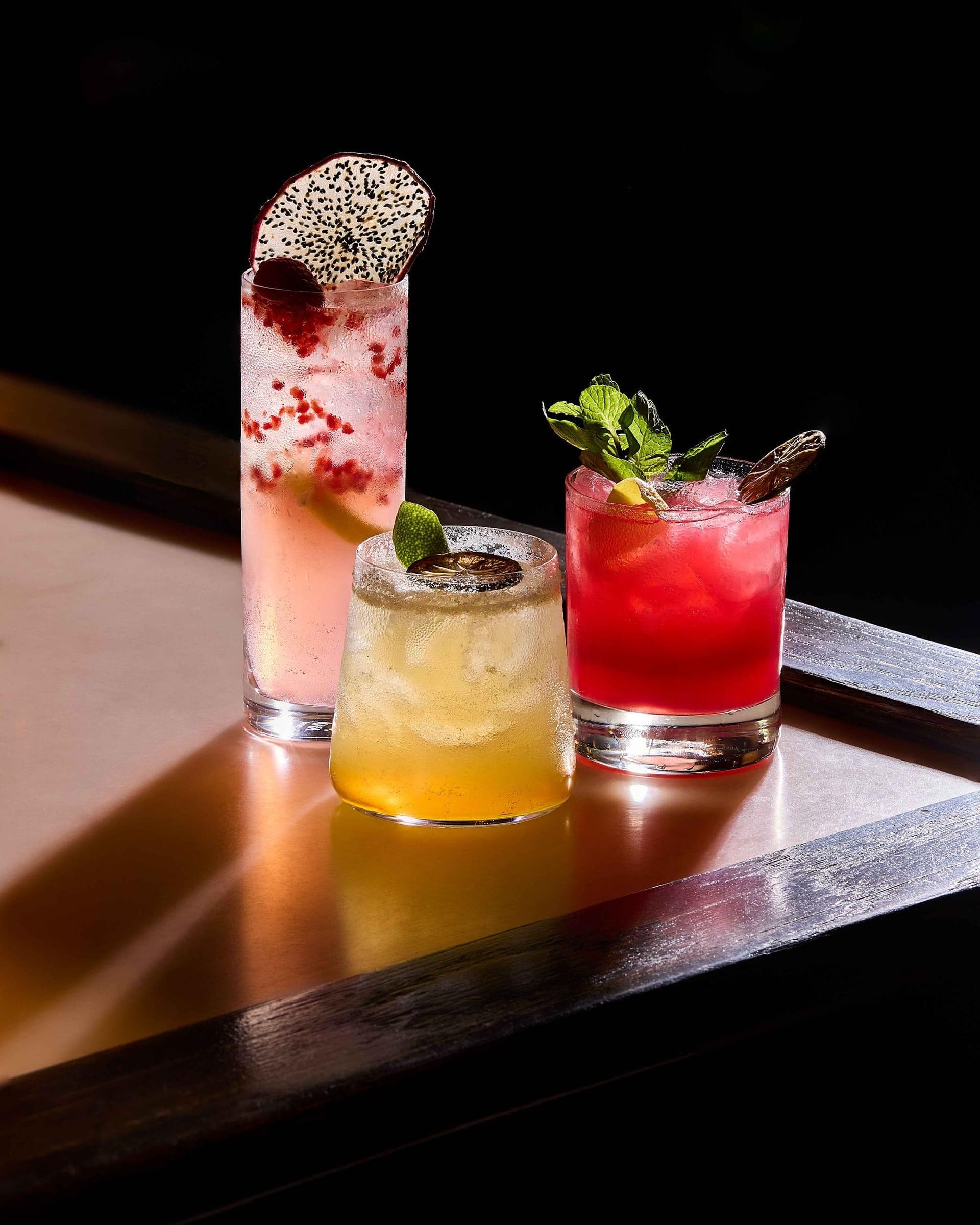
Backgrounds and Settings
Where does your product live in images?
Background Options: - Pure white for e-commerce - Neutral textures (concrete, wood, fabric) - Lifestyle environments (kitchens, offices, outdoor settings) - Branded backgrounds with your colors or patterns
Environmental Context: - Urban vs. natural settings - Modern vs. vintage aesthetics - Minimal vs. richly styled scenes
Define when to use each type of background. For example: "Pure white for product detail pages, lifestyle settings for social media, textured neutrals for homepage hero images."
Props and Styling
Props add context and personality, but they need guidelines to stay consistent.
Approved Prop Categories: - What kinds of objects complement your products - Materials and textures (natural wood, metal, ceramics) - Colors that align with your brand palette
Styling Principles: - How much to include in a shot (minimal vs. abundant) - How to arrange elements (organized vs. organic) - How to show human elements (hands in frame, models, etc.)
Create a physical or digital prop library that photographers can reference for shoots.
Model and Diversity Guidelines
If your photography includes people, define:
Model Selection: - Age ranges that represent your target customer - Diversity and inclusion standards - Expression and emotion (smiling vs. neutral, candid vs. posed)
Wardrobe and Styling: - Clothing styles that align with your brand (casual, professional, athletic) - Colors and patterns (solid colors vs. patterns, brand colors vs. neutrals)
Interaction and Lifestyle Context: - How models interact with your products - Settings and activities that reflect your brand values
This ensures that lifestyle photography feels cohesive even when you're working with different models and photographers.
Creating a Visual Style Guide Document
Your guidelines should live in a documented style guide that everyone on your team (and any external collaborators) can reference.
What to Include
Section 1: Brand Overview - Your brand values and positioning - Target audience and customer personas - How visual identity supports brand strategy
Section 2: Photography Principles - Lighting rules with reference images - Composition and framing guidelines - Mood and aesthetic direction
Section 3: Color Standards - Brand color palette (with hex/RGB/CMYK values) - Color grading presets or instructions - Examples of correct and incorrect color use
Section 4: Background and Setting Guidelines - Approved backgrounds with examples - When to use each background type - Environmental and context rules
Section 5: Props and Styling - Approved prop library with images - Styling dos and don'ts - Examples of well-styled shots
Section 6: Post-Production Standards - Editing workflow and software - Retouching guidelines - Export settings for different use cases
Section 7: Platform-Specific Adaptations - How to adapt your visual identity for Instagram, website, email, print, etc. - Aspect ratios and technical specs - Examples of content optimized for each platform
Make It Visual
Your style guide should be heavily visual. Include:
- Reference images for every guideline
- Side-by-side comparisons (correct vs. incorrect)
- Annotated examples explaining why specific choices work
- Mood boards showing the overall aesthetic
We typically create style guides in tools like Figma, Notion, or Google Slides: something that's easy to update and share with collaborators.
Maintaining Consistency Across Platforms
Different platforms have different technical requirements and audience expectations. Here's how to adapt while maintaining consistency.
Website
Your website is typically the most polished, aspirational version of your visual identity.
Photography Needs: - High-resolution hero images - Product detail photography on white backgrounds - Lifestyle images showing products in use - About/team photography reflecting brand values
Consistency Strategy: - Use your core photography style across all pages - Maintain consistent color grading sitewide - Create templates for different page types (product pages, landing pages, blog posts)
Social Media (Instagram, Facebook, TikTok)
Social media needs higher volume and more variety than your website, but it should still feel cohesive.
Photography Needs: - Square and vertical formats optimized for feeds and stories - Mix of polished and behind-the-scenes content - User-generated content that aligns with your aesthetic
Consistency Strategy: - Use a consistent filter or color grading preset - Maintain a consistent grid layout or pattern (e.g., alternating product shots and lifestyle images) - Create templates for graphics and text overlays - Develop a content calendar that balances variety with consistency
Email Marketing
Email is where many brands lose visual consistency. Don't let design constraints compromise your identity.
Photography Needs: - Header images optimized for email width - Product images with transparent backgrounds - Lifestyle photography that reinforces seasonal campaigns
Consistency Strategy: - Use the same photography style as your website and social media - Apply consistent color grading even to small email images - Create email templates with branded layouts and typography
Print and Packaging
Print requires higher resolution and different color handling (CMYK vs. RGB).
Photography Needs: - Ultra-high-resolution product photography - Print-specific color profiles - Images that work in both color and black-and-white if needed
Consistency Strategy: - Shoot at high enough resolution to support large-format print - Provide photographers with CMYK color references - Proof print materials to ensure colors match digital versions
Retail and Point-of-Sale
In-store visuals need to work at scale and from a distance.
Photography Needs: - Large-format, high-impact imagery - Clear, simple compositions that read quickly - Lifestyle photography showing products in aspirational contexts
Consistency Strategy: - Use the same photography from other channels, sized appropriately - Ensure lighting and color remain consistent when printed large - Design signage templates that incorporate brand photography consistently
Using Mood Boards and Reference Libraries
Before any photoshoot, create a mood board that aligns with your visual brand guidelines.
What to Include in a Mood Board
- Reference images from brands with similar aesthetics
- Color palettes and swatches
- Composition and framing examples
- Lighting references
- Styling and prop inspiration
Mood boards bridge the gap between written guidelines and actual execution. They give photographers and stylists a clear visual target.
Building a Reference Library
Over time, create a library of your own best work. Organize it by:
- Product category
- Platform (website, social, email)
- Season or campaign
- Photography style (lifestyle vs. white background vs. detail shots)
This library becomes your ultimate reference: instead of showing photographers external examples, you can say, "Make it look like this image we shot last quarter."
How AI Helps Maintain Brand Consistency at Scale
In 2026, AI tools are making it dramatically easier to maintain visual consistency across large image libraries.
Automated Color Grading
AI-powered editing tools can learn your brand's color grading style and apply it consistently to new images.
How it works: 1. Train the AI on a set of 20-30 properly graded images from your brand 2. The AI learns your color preferences (temperature, saturation, contrast, specific hue shifts) 3. Apply that style automatically to new images
This is incredibly valuable when you're working with multiple photographers or shooting high volumes of content.
Background Replacement and Scene Generation
AI can composite your products into consistent, on-brand environments without requiring expensive location shoots.
Use cases: - Seasonal campaigns: Create summer and winter versions of the same product shot - Platform optimization: Generate vertical and horizontal crops with intelligent background fill - A/B testing: Test different backgrounds while keeping the product photography identical
At our studio, we use AI scene generation to create lifestyle images that maintain perfect consistency with our clients' brand guidelines. We shoot the product once, then composite it into approved environments.
Style Transfer for UGC
User-generated content is authentic and valuable, but it rarely matches your brand aesthetic. AI style transfer can:
- Adjust color grading to match your brand palette
- Apply consistent filters and effects
- Unify lighting and contrast across diverse source images
This lets you leverage UGC while maintaining visual consistency across your feed.
Consistency Analysis and Quality Control
AI tools can analyze your entire image library and flag inconsistencies:
- Images that don't match your color palette
- Lighting that deviates from brand standards
- Composition patterns that break your guidelines
This is especially useful for large brands with thousands of product images and multiple content creators.
Case Study: How Visual Consistency Transformed a Brand
We worked with an Austin-based e-commerce brand that had grown rapidly but had inconsistent photography across their catalog. They'd worked with multiple photographers over three years, and their product pages looked chaotic: some products were shot on white, others on gray, others in lifestyle settings. Color grading varied wildly.
The Challenge: - 200+ product SKUs with inconsistent photography - Low conversion rates compared to competitors - Weak brand recognition on social media
Our Solution: 1. Created comprehensive visual brand guidelines with specific photography rules 2. Developed color grading presets for post-production 3. Re-shot their entire catalog in batches over 3 months 4. Implemented AI tools to maintain consistency for new products
The Results: - 35% increase in conversion rate on product pages - 50% increase in Instagram engagement (consistent grid increased follower growth) - Customers began recognizing their products in user-generated content without seeing the logo
The brand now has a distinctive visual identity that competitors can't easily replicate. Every new product shoot references the style guide, and consistency is maintained at scale.
Building Long-Term Visual Equity
Visual consistency isn't a one-time project: it's an ongoing commitment. Here's how to maintain it over time.
Quarterly Audits
Every quarter, review your visual content across all platforms:
- Are new images following the guidelines?
- Has color grading drifted?
- Do you need to update guidelines based on new learnings?
Evolve, Don't Reinvent
Your visual identity can evolve, but it should evolve gradually. Avoid:
- Abrupt style changes that confuse customers
- Following trends that don't align with your brand
- Letting individual campaigns override brand consistency
Instead, make small, intentional refinements that keep your brand fresh without losing recognition.
Educate Collaborators
Anyone creating visual content for your brand needs to understand the guidelines:
- Onboard new photographers and designers with your style guide
- Provide feedback that references specific guideline principles
- Share examples of excellent work that embodies your visual identity
Measure Brand Recognition
Track metrics that indicate visual consistency is working:
- Brand awareness surveys (do customers recognize your visual style?)
- Social media engagement (consistent feeds perform better)
- Conversion rates (inconsistent product photography lowers trust)
Ready to Build a Cohesive Visual Brand Identity?
Visual consistency is one of the highest-leverage investments you can make in your brand. It doesn't just make your marketing look better: it builds recognition, trust, and long-term brand equity.
At 51st & Eighth, we help brands create and maintain cohesive visual identities through detailed photography guidelines, systematic production, and AI-powered tools that scale consistency across every platform.
Based in Austin, Texas, we work with brands that are serious about their visual identity. We'll help you define your photography style, create comprehensive brand guidelines, and execute photoshoots that deliver consistent, on-brand imagery every time.
Whether you're starting from scratch or refining an existing visual identity, we'd love to help you build a brand that customers recognize instantly.
Ready to create a visual brand identity that wins? Visit our services page to see our packages, or reach out to discuss your specific needs. Let's build something distinctive together.
Frequently Asked Questions
How often should I update my visual brand guidelines? Review your photography guidelines annually, but only make significant changes when there's a strategic reason: rebrand, new target audience, major product line shift. The biggest mistake brands make is updating their visual style every season chasing trends. The most recognized brands maintain their core photographic style for years with only small refinements.
What's the minimum set of photos I need to establish a visual brand identity? For a product-based brand: 5–8 hero product shots, 10–15 lifestyle images showing products in context, and 3–5 brand texture/detail shots. This foundation: shot in one cohesive session: establishes your visual language and can fuel 3–6 months of marketing content before you need to shoot again.
How do I create consistency when working with multiple photographers? Document your style in a photography brand guide with visual examples (not just written descriptions), then share it with every photographer before every shoot. Include: a mood board, 5–10 "approved look" reference images, 3–5 "do not want" counter-examples, and specific notes on color temperature, lighting style, and composition approach. Brief, visual, specific.
Does AI help or hurt brand consistency? When used correctly, AI dramatically improves consistency at scale. Custom AI models trained on your approved photography learn your brand's visual language and apply it to generated variations. The risk is the opposite: using generic AI tools without brand training produces inconsistent output that erodes visual identity faster than having no content at all.
Ready to elevate your brand identity photography?
Get a free quote from Austin's leading brand photography studio.
Get a Free Quote →